Check your LinkedIn profile right now, what do you see first?
Most likely it’s your profile picture and your Linkedin banner.
So, if you don’t have a personalized banner yet, create one right now.
Yes, I am being bossy but I need to be.
Banners are really powerful! Because it’s true a picture paints a thousand words and a thousand more words than you can articulate in your profile itself.
If we see something, we believe it so.
That’s why actually having a banner on LinkedIn is a really powerful way to get your message across beyond the words that you use on your profile.
Your message is going to be received and believed a whole lot faster compared to when somebody simply scans the words in your profile.
Think about it like this. If we see somebody in a pilot’s uniform standing next to a plane, we believe they’re a pilot. If we see somebody in a white coat, we believe they’re a doctor.
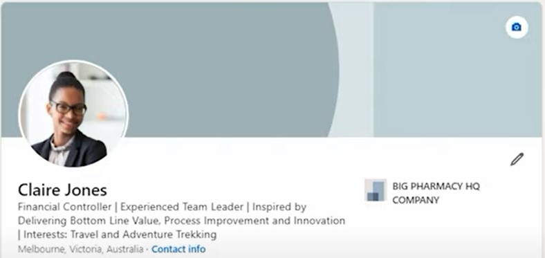
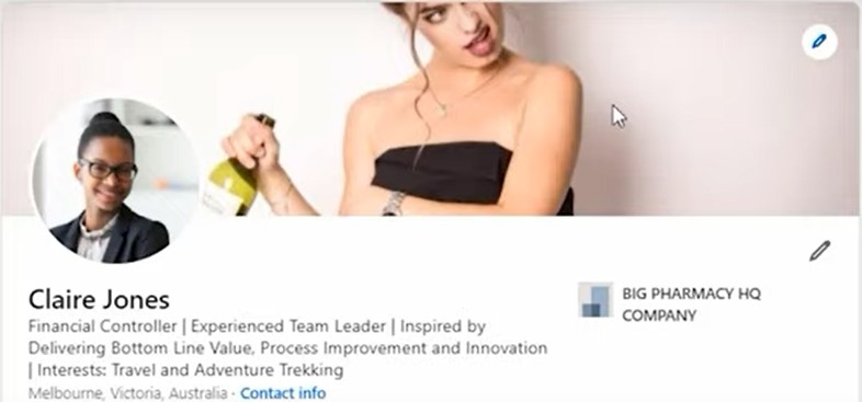
So, don’t waste this opportunity to create a fantastic first impression by just going for the default banner LinkedIn suggests. It’s really dull and really boring:
In this blog, I’m going to give you:
- Tips to create the best LinkedIn banner if you’re looking for a job
- Examples of some banners that I think really work
- Free resources you can use to create your own fantastic banner
Best LinkedIn Banner Ideas and Examples
So, what makes a great banner?
Here are some examples of banners that I think work really well.
Hopefully, this can give you some great ideas about what you can put on your banner.
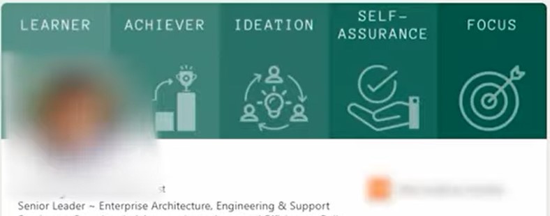
In the image below, this person has taken some strengths that he’s identified in a psychometric profile that he’s done at work and put them at the top of his banner. He’s got learner, achiever, ideation, self-assurance, and focus. These are words that you could instantly associate with his LinkedIn profile.
In the next example, this picture is pretty simple but powerful.
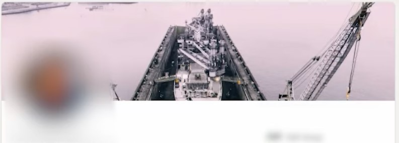
It’s a picture of an oil rig.
This person is a Project Engineer and Project Manager working that oil rig.
So, with the help of his banner, you instantly can picture him in the context of his working environment and believe that that’s what he does.
I really love this next example of a banner as well.
This person is giving a speech – he’s clearly confident, a leader, and an influencer. His quote that he’s put up actually supports that image too. So, you can picture those words coming out of his mouth as a leader or as a speaker.

Free LinkedIn Banner Resources and Templates
Here are the free resources I promised to help you create an amazing LinkedIn banner.
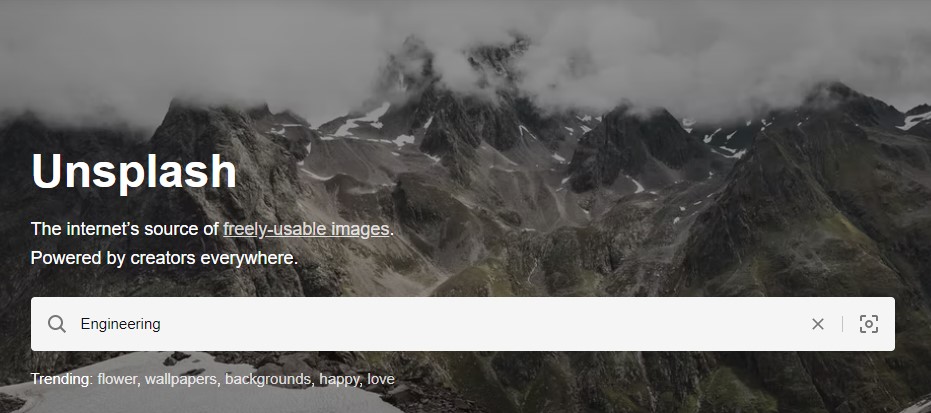
Unsplash
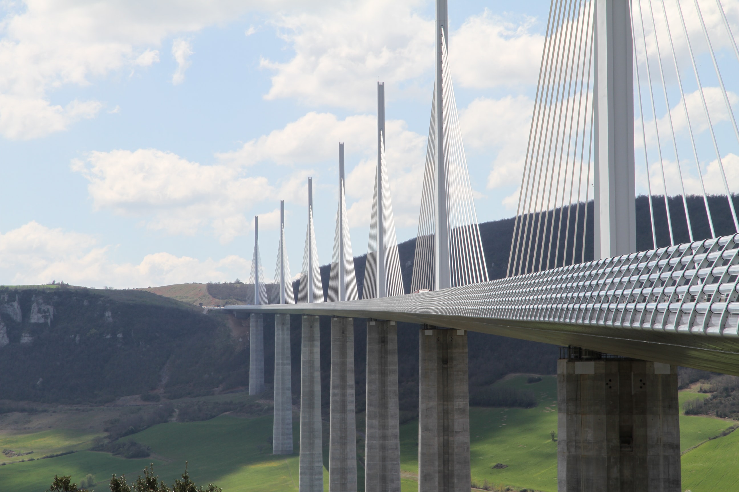
What I do with Unsplash is type in a keyword to bring up the types of images that I’d like to see. For example, if I want to bring up an engineering image I’d type in the word “engineering”.
I pick an image that represents what I’d like to get across.
I quite like this bridge image so I’ll download it:
Canva
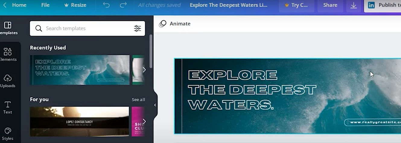
Now I’ve downloaded the image, I hop over to Canva.
I type in “LinkedIn banner” because Canva gives you a whole bunch of pre-formatted examples and ideas that I can use for the layout of my banner.
What I tend to do is pick a free image that has a layout I like so I can copy the proportions and replace the text.
I can change absolutely everything on this image from the text, the fonts, the color, to the background image.
If I want to replace the background image, I basically can click on the background image that’s already there to delete it and upload the bridge image which I’ve done earlier.
I can just resize it to make sure that the proportions fit quite nicely, and I can move it around to get the exact image in the exact place.
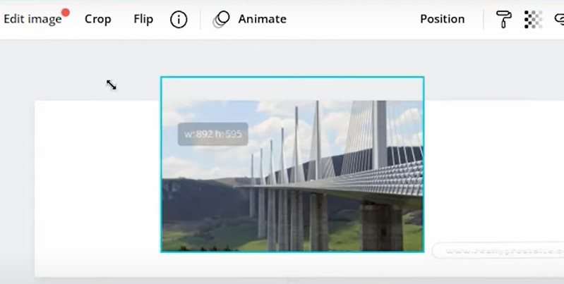
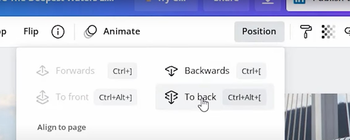
I want to position it to the back, so I hit “position” and I hit “to back.”
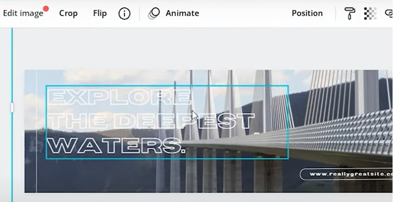
I can change the text by clicking on the text. I can change the color of the text, the font, and all sorts of things to create the image that I want that I think will highlight something fantastic about the work that I do.

Most Common LinkedIn Banner Mistake to Avoid
What’s the number one mistake that I see with people when they create banners for their Linkedin profile?
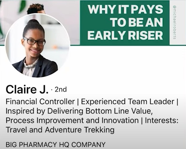
Well apparently, LinkedIn’s own research says that more than 50% of people are actually going to view your LinkedIn profile on a mobile device.
What I suggest you do is actually upload your banner using your laptop or your desktop, because that’s easier.
Then go and have a look at your banner on a mobile device to see if you can see the words that you want to get across.
Here’s a dummy profile that I mocked up earlier just to show you what that could look like:
I hope you found this insanely useful in creating your own LinkedIn banner!

 Follow

{ 0 comments… add one now }